Case study
Pathfinder
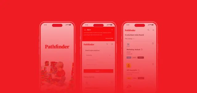
An app connecting people looking for work experience with companies and non-profit organisations. Google certification project.

02Mobile app
The brief
What we set out to solve
Goal
Design a socially useful app where people can find placements or volunteering opportunities and easily contact an organisation.

Who it is for
Mainly students aged 18 to 30 who need work experience to find the job they want.
Screens
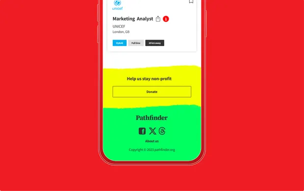
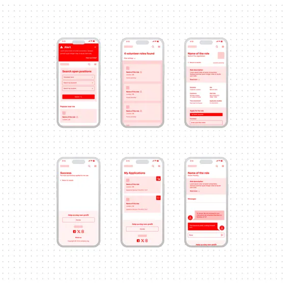
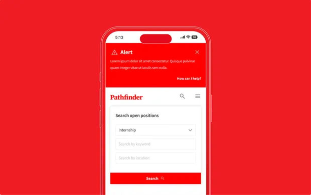
What it looks like
UX process
How we approached it
We added ideation exercises and a storyboard to our research and personas. Only then did we create the architecture, wireframes and tested prototype.
- 01Interviews
- 02Questionnaire
- 03Personas
- 04User journey
- 05Competitor analysis
- 06"How might we"
- 07Crazy 8
- 08Storyboard
- 09Information architecture
- 10Wireframes
- 11Usability testing
- 12Iterations
- 13Final design
- 14UI kit
Research
Research findings
Respondents wanted to gain experience and communicate easily with the organisation that posted the opportunity.
80 % would like to gain experience by volunteering for a non-profit organisation
50 % would like to gain experience through an internship at an established company
Communication should be simple and direct, with the organisation that posted the opportunity.
Persona
Who we designed for
One of the project's two personas. The other, Eva, is looking for a marketing internship.
Andrej
24 years old · student · Munich
"Coding towards innovation."
Goals
Use his programming skills to build software for non-profits and work with other developers on community projects.
Frustrations
He struggles to find volunteering opportunities for advanced programmers, and few local non-profits are looking for technical help.
Problem
Andrej is looking for a platform that quickly connects him with non-profits where he can use his skills.
Competitors
Competitor analysis
We compared volunteering and internship platforms. Each meets only part of the need.
| PLATFORM | STRENGTHS | WEAKNESSES |
|---|---|---|
| All For Good | Google partnership, simple interface. | Limited personalisation and regional restrictions. |
| Idealist | Focus on social impact, useful filters. | Complex interface, few users in some regions. |
| VolunteerMatch | The largest database, advanced search. | Non-profit organisations only. |
Uses an existing network of contacts. | Volunteering gets lost among other opportunities. |
Testing
Testing and iterations
Usability testing of the prototype showed how people actually use the opportunities. We adjusted the design accordingly.
Saving an opportunity
Most participants wanted to save an opportunity and return to it later.
A quick overview
On opportunity cards, people mainly looked for the location, type of work and distance from home.
Checking an application
Almost everyone wanted to check for mistakes after submitting an application.
Design
Final design
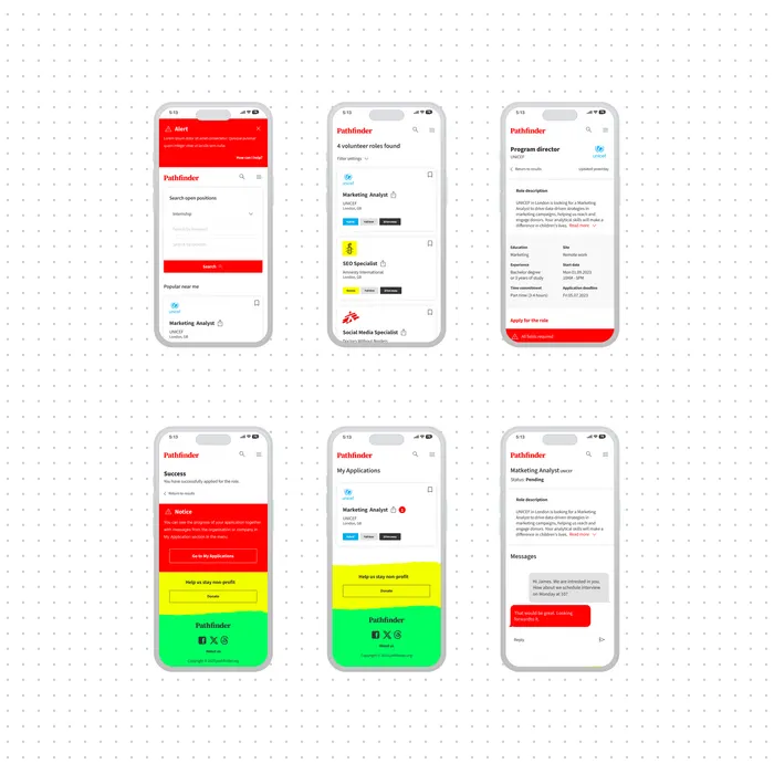
Findings and next steps
People do not apply straight away. They save opportunities first.
KEY FINDINGS
- The app is more useful when it brings volunteering and internships together in one place.
- People do not read long descriptions. They look for a few key details.
NEXT STEPS
- Adding interviews and deadlines to a calendar.
- An introductory guide to the app's features.
- Alerts for new opportunities, since the job market moves quickly.
Next project
See another case study
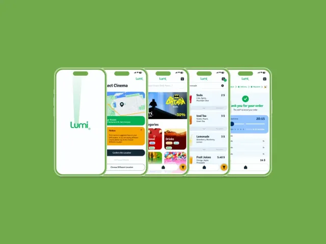
Lumi
An app for ordering cinema snacks.


Contact
Let’s talk through
your project.


Tell us what
you are planning.
A few sentences are enough: what you need, who it is for, and when you would like it. We will get back to you with a proposed next step.